


Grid Utility – Case Study
Grid Utility
Grid Utility is a proud provider of energy solutions with a management team that boasts over 100 years of combined electric utility experience. They came to us to create a new brand experience that represents their years in the electrical power industry while clearly communicating their extensive knowledge in Electrical Distribution – Aerial and Underground, Broadband / Fiber Optic – Aerial and Underground, and Emergency / Disaster Response.
Grid Utility required a complete branding and identity including creation of the company logo, stationary, business cards, marketing collateral and website. The digital brand strategy to be carried throughout the brand and user experience needed to reflect their services and knowledge as a leader in the power management industry. The new brand identity will be repeatedly communicated in multiple ways with frequency and consistency throughout the life of the business.
Branding – Logo – Identity – Marketing Collateral
The Vision
The vision for the Identity and Branding was to create a clean and organized design for the logo, website navigation, information flow and content layout, while communicating the professional services offered by Grid Utility. The challenge was how to differentiate Grid Utility from the vast group of competitors, while conveying their passion for building personal relationships and delivering true customer support. The designs needed to highlight the services and knowledge they provide to help manage the growth, maintenance and operation of a power utility system.
We helped Grid Utility communicate their story through brand identity, a modern online experience and consistent design throughout all their marketing and identity collateral.
Branding
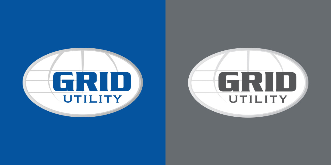
We designed a brand identity that is strong and universal yet approachable. The design concept is based on their wide range of services in the power and electric utility industry with the use of the globe as the symbol of their combined years of experience and knowledge they provide. We utilized the color blue as the base color, which symbolizes loyalty, strength, wisdom and trust. The overall style and concept represents Grid Utility as a trusted member of the Power Utility Partners and conveys and enduring strength of their brand and services.

My Role
I worked with the client team to understand the overall objectives and business needs for the creation of their Identity and Branding with the design of the company logo and color palette. Working together with the clients we finalize the website content used to create the overall information architecture for the website. This was carried throughout the design and development in the mindful creation of the content structure, navigational flow and layout of all pages. I designed and implemented the visual and functional structure of the website with the use of WordPress CMS and creative use of HTML5 and CSS3. I successfully accomplish all aspects of the Identity and Brand for Grid Utility which has provide a return on her investment.
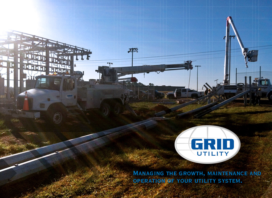
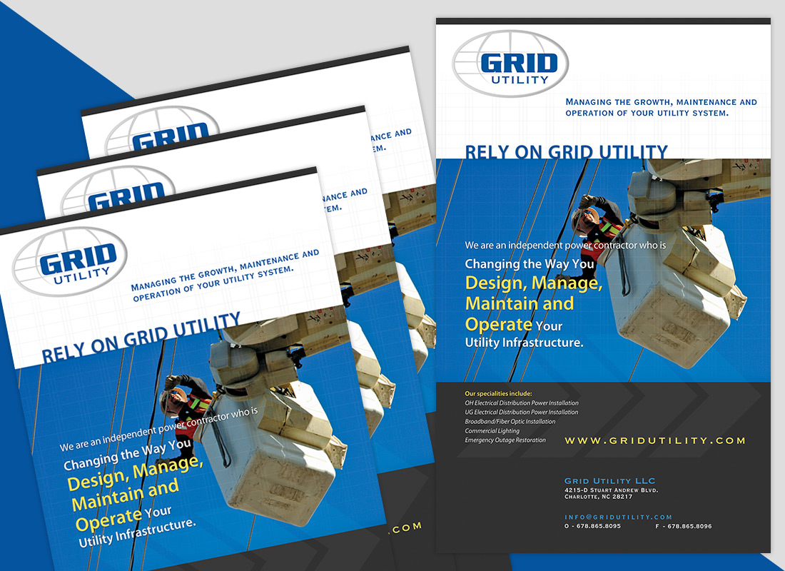
Grid Utility is an independent power contractor who is changing the way you design, manage, maintain and operate your utility infrastructure. We design custom graphics that clearly communicates Grid Utility as leaders in the Electrical Distribution, Broadband Fiber Optic and Emergency Disaster Response industry.
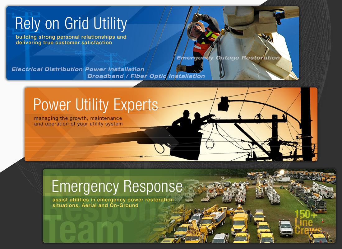
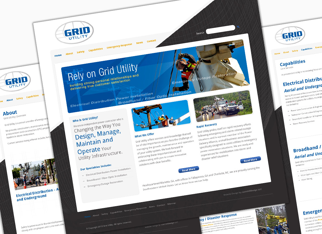
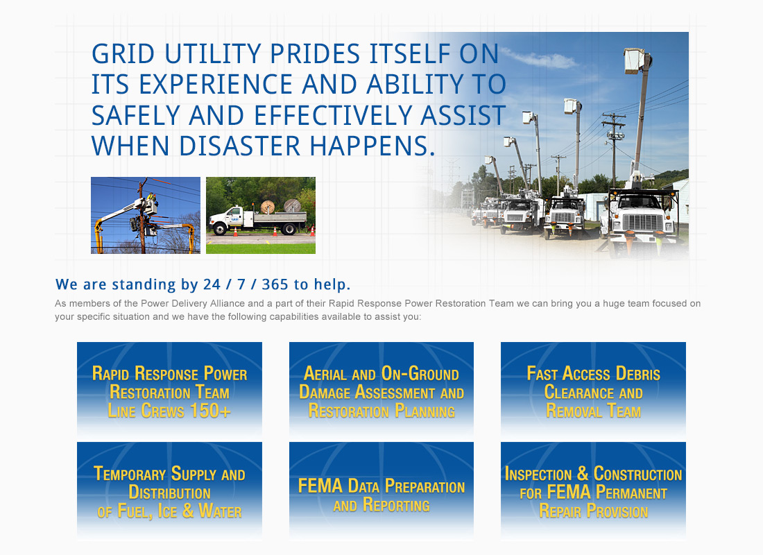
Grid Utility also provides rapid recovery efforts following emergency and storm related outage situations and is a proud member of the Power Delivery Alliance, a small business association specifically designed to assist utilities in emergency power restoration situations. It was vital that their unique capabilities and services for the emergency response system was clearly designed and easy to understand for the clients.

Collateral
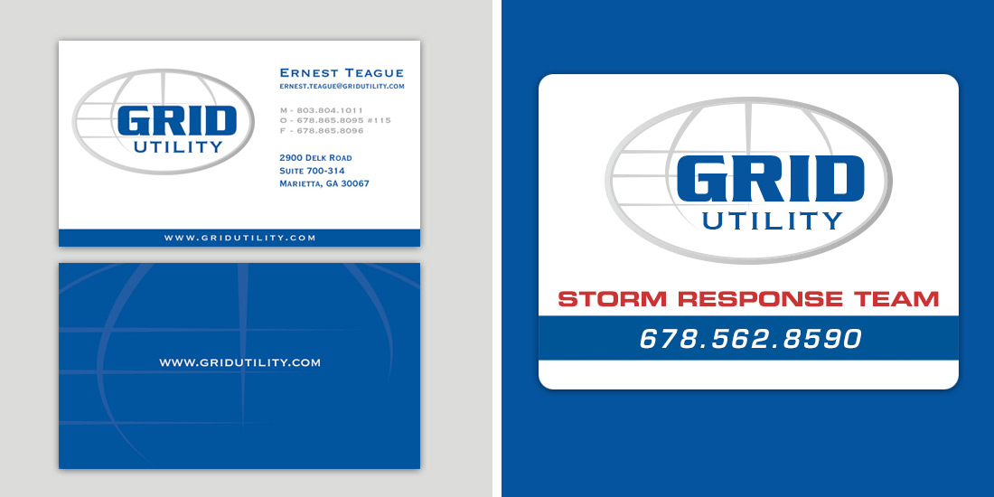
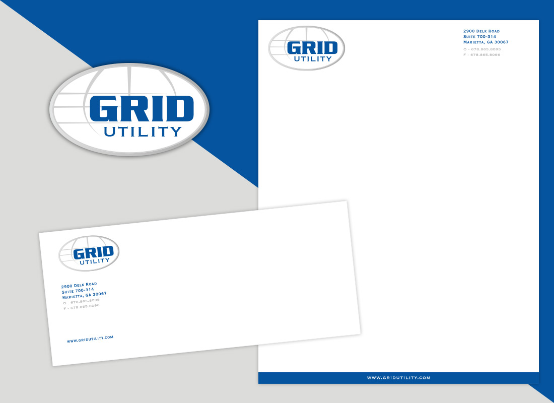
Creating a consistent style across your collateral is critical to building a brand identity that allows your customers to instantly recognize your company and distinguish it from others. For Grid Utility we created a collateral system that aligns with the business objectives creating a unified identity, consistent color palette, style, and visual assets applied across all media. The Grid Utility collateral included business cards, letterhead, envelope, truck signage and marketing ads to run in the industry standard advertisements online and traditional print media.
Our final creative design solutions for the Grid Utility brand, website and marketing collateral creates a cohesive identity system that makes Grid Utility stand out in their specialized industry. The brand identity connects product recognition for Grid Utility as a trusted partner to build relationships, manage and maintain the operation of your power utility system, and deliver true customer satisfaction.

Project Overview
Creation of an all new modern Brand, Logo and Website for Grid Utility. Including creation of all graphics and designs for the website.
Creative Strategy & Creative Consulting
- Understand your vision and requirements
- Create outline and workflow
- Brainstorm ideas and solutions
- Content review and updates
Info Architecture UI/UX Graphic & Web Design
- Overall web site information flow & structure
- Create sketches & wireframes
- Developed the branding guidelines, color palette, type treatments
- Designed the creative vision into a Brand and Identity Solution
- Design the creative vision into graphical screen designs and all graphical interface elements
Front-End Development & WordPress Solutions
- Develop the page layouts and design with HTML – CSS and WordPress Shortcodes
- Test on browsers and devices
- Client review, revisions, updates
- Launch website
How can we help you with your next design project?
Meeting exciting people, starting new projects and concepts is what makes us excited. So go ahead and get in touch and let's create something cool!