


Version III – Case Study
Version III
Version III required a complete identity and branding for their song writing, music production and publishing company with the creation of the overall color palette, logos and identity collateral. We needed to design and create a brand experience that clearly communicates their love and passion for music with meaning. Version III is about the real meaning in music and the new brand must connect their strong ties to musicians, while conveying their message of a reliable and professional music and publishing company for new and current musicians and song writers.
Branding – Logo – Identity Collateral
The Vision
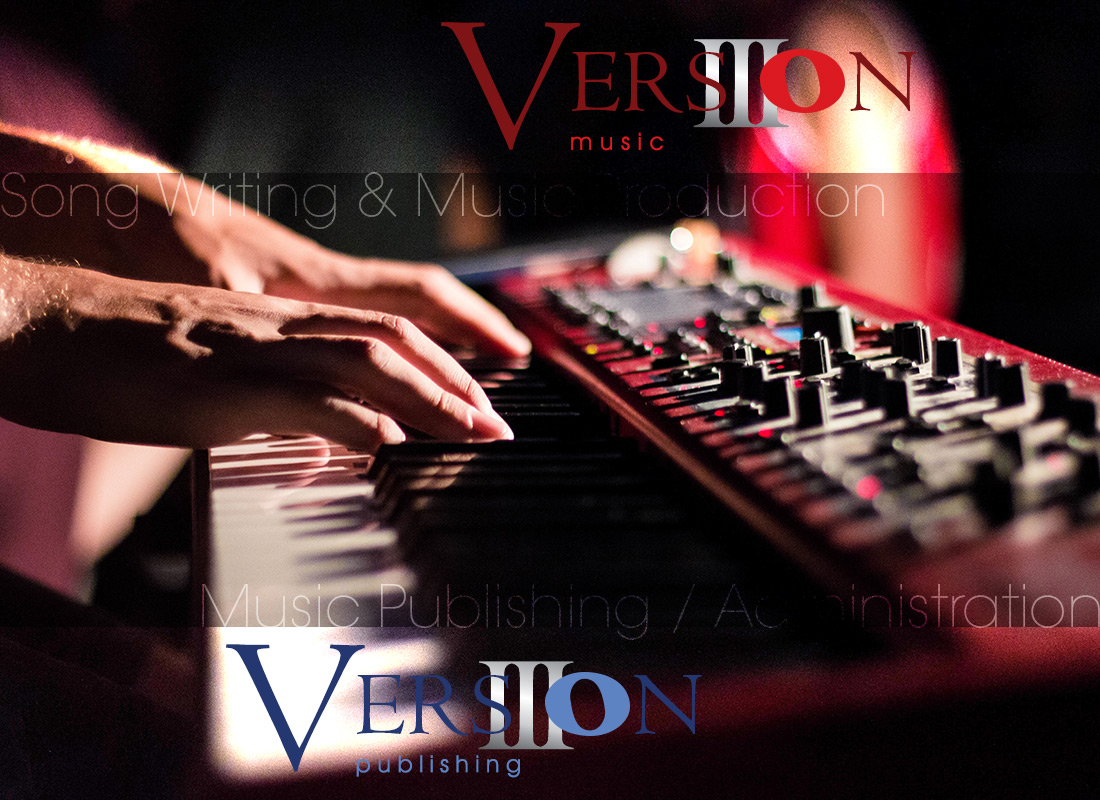
The vision for the Version III brand was to design a logo and brand mark that embodies it’s creator as a song writer and musician. The owner, Jake The III wanted to incorporate a roman numeral III as a symbol of his family name and the services he provides in song writing, music production and music publishing. We worked with Jake to ensure his vision for the brand identity was memorable and a unique image for the business that customers can use to identify him in a crowd.
Your Brand is a combination of color schemes, designs, words, etc., that your company employs to make a visual statement about itself and to communicate its business philosophy. It is an enduring symbol of how a company views itself, how it wishes to be viewed by others, and how others recognize and remember it.
Branding
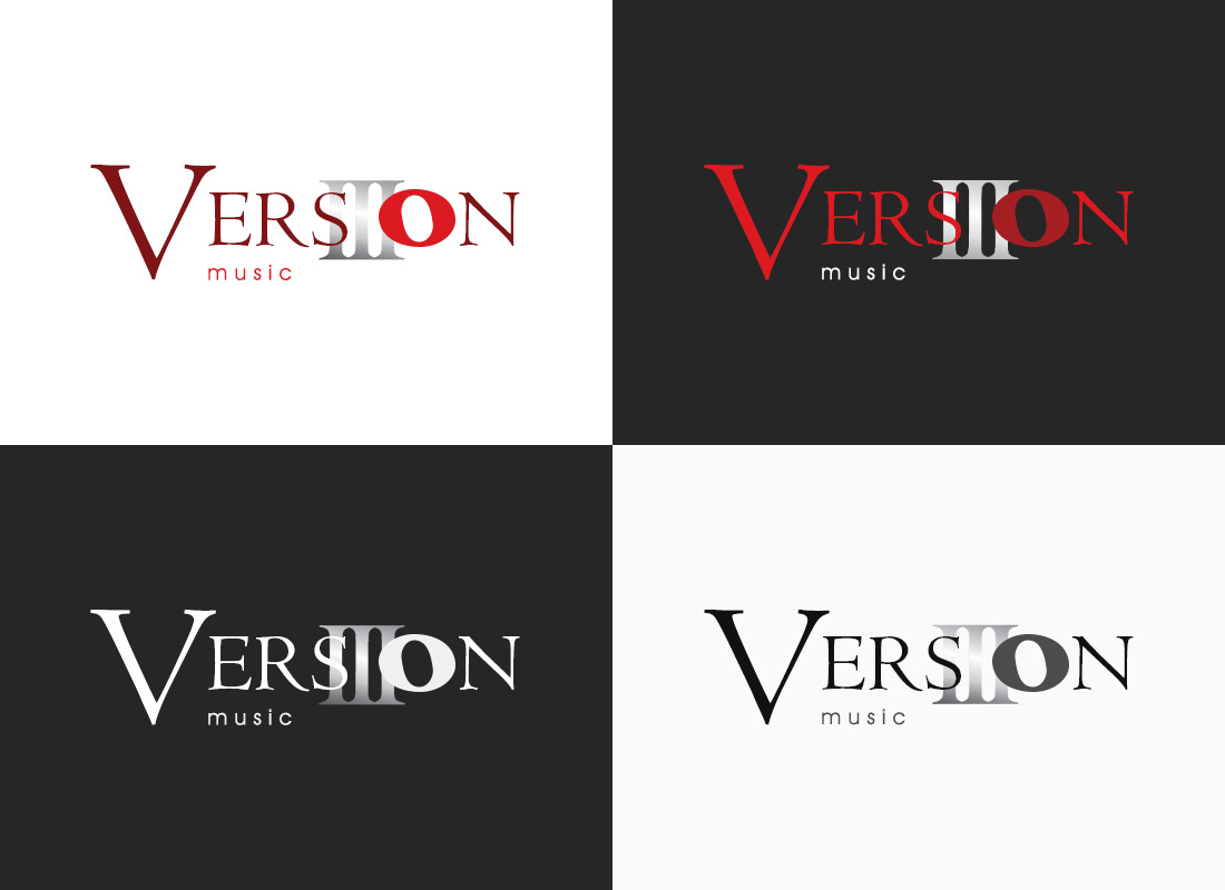
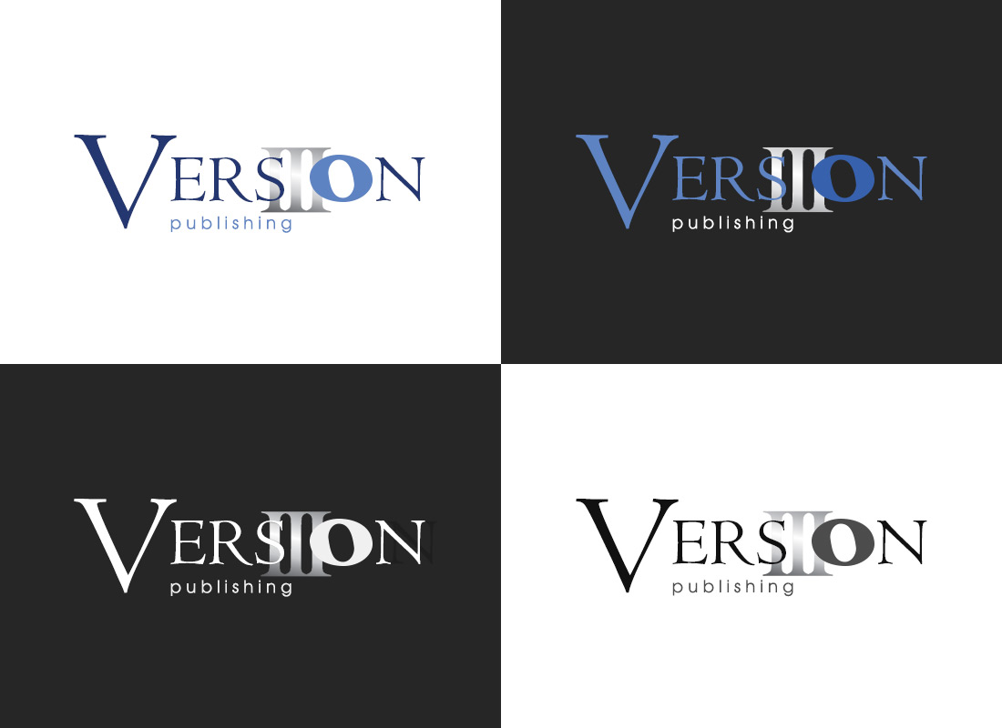
We began our brand strategy with a client side brainstorming session and a concepting round to finalize the brand essence. Our solution was to create a brand mark that symbolizes the three key services Version III offers while still creating an image that embodies music, song writing and publishing. We utilized the Whole Note in music for the “o” in the Version wording as a subtle tie to sheet music and musical notes that indicate the pitches (melodies), rhythms or chords of a song or instrumental musical piece.
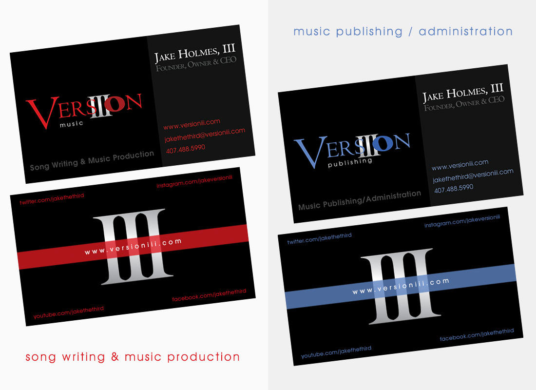
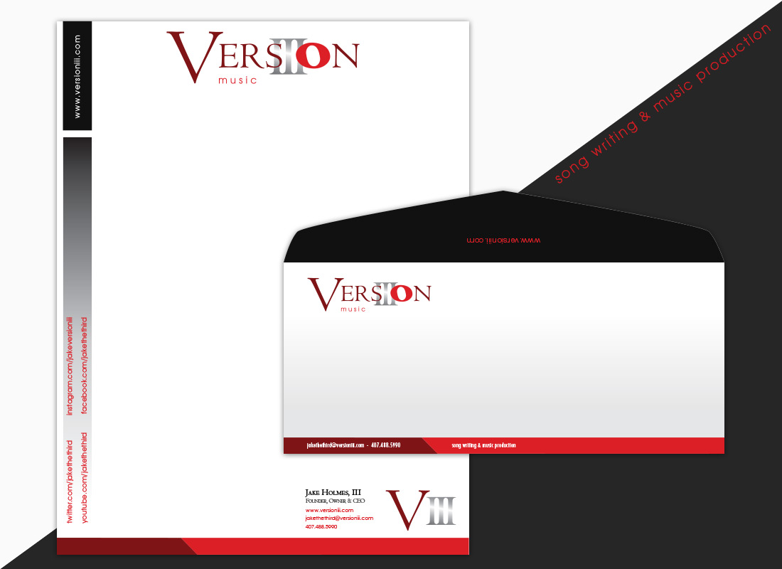
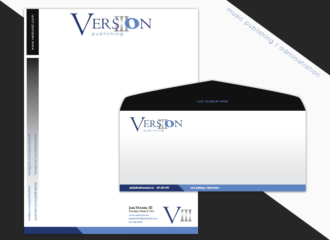
Since there are two departments in Version III, one for song writing & music production and one for music publishing / administration we decided to separate the two with a simple color change and wording to note each of their specific services. The color palette for Version III music is red, which is associated with energy, strength, power, and determination. Red is a very emotionally intense color and enhances human metabolism, increases respiration rate, and raises blood pressure. Which is the same thing music with real meaning can do. The color palette for Version III publishing is blue, which symbolizes loyalty, strength, wisdom and trust. These are specific traits you want a company to have when working with them to provide you with their services and support.
The final result was a brand image that exudes authenticity, strength, power, confidence, and loyalty with a logo mark that creates a positive message and image for musicians and song writers.

Final solution for Version III music
Song Writing & Music Production
Final solution for Version III publishing
Music Publishing / Administration
My Role
I worked with the client gathering information, brainstorm ideas and understand the vision and project requirements. We developed a working solution and I applied this information to the design of the brand which is carried throughout the logo and identity collateral. As the Creative Lead and Designer I developed the branding guidelines, color palette, type treatments and created all designs. I ensured all design collateral and marketing materials have a cohesive and consistent look and voice to represent the Version III corporate image.
The new Version III brand image is carried throughout the logo and identity system with the use of consistent color, type, layout and style. All based on the principles of design and our creative vision.
Identity Collateral
Building brand identity collateral that allows your customers to instantly recognize your company and distinguish it from others is critical is today’s work place. For Version III it was essential that we create a collateral system that clearly distinguishes between the two divisions of the company. We utilized the new brand image and applied this to the collateral designs to support Version III’s primary advertising message to musicians and song writers as a trusted resource in the competitive music production and publishing industry.
We successfully designed and created the Version III brand and identity collateral with a simple, yet effective design and brand message which resulted in a satisfied client.

Project Overview
Creation of Version III music and publishing Branding, Logo and Identity Collateral.
Creative Strategy & Creative Consulting
- Understand your vision and requirements
- Create outline and workflow
- Brainstorm ideas and solutions
- Content review and updates
Graphic Design & Branding Design
- Create sketches and rough designs
- Developed the branding guidelines, color palette, type treatments
- Designed the creative vision into a Brand and Identity Solutions
How can we help you with your next design project?
Meeting exciting people, starting new projects and concepts is what makes us excited. So go ahead and get in touch and let's create something cool!