


The Kerning Game
The art of spacing your type is know as kerning and also tracking. In typesetting, the process of subtracting space between specific pairs of characters so that the overall letterspacing appears to be even is KERNING. Where the overall tightness or looseness of the spacing between all characters in a line or block of text is known as TRACKING. Although allot of designers only use the term KERNING when adjusting type is their designs. Anyone who works with letters extensively knows that good spacing is often more important than good letters. In “Lettering as a Work of Art”, the essay that prefaces Treasury of Alphabets and Lettering (1966 but originally Meisterbuch der Schrift, 1952), Jan Tschichold says, “Good lettering demands three things:
(1) Good letters.
A beautiful letterform must be selected which is appropriate to the purpose it is to serve and to the lettering technique to be used.
(2) Good design in all details.
This calls for well balanced and sensitive letter spacing and word spacing, which takes the letter spacing into account.
(3) A good layout.
A harmonious and logical arrangement of lines is essential.
None of these three demands can be neglected. Good lettering requires as much skill as good painting or good sculpture.” He goes on to demonstrate “good and bad letters” and how to properly space capitals and lowercase letters. “Letter spacing should not be mechanically equal but must achieve equal optical space. The letters must be separated by even and adequate white areas,” he writes. Easier said than done. Some of the samples of “unsatisfactory” spacing that he shows fit these criterion but do not balance the space between letters with the space inside letters. And it is that balance of the inner and outer that makes for ideal letter spacing.
But, as Tschichold shows, the letters of the Roman alphabet pose problems for anyone hoping to achieve such perfection. They are not only variable structurally but they differ greatly from style to style, from typeface to typeface. Thus, there are letter combinations that are inherently awkward if not fiendishly difficult to space properly. Especially in metal type where letters are constrained by their bodies. But this age-old limitation disappeared years ago with the advent of phototype and its successor digital type. Today, the only restriction on good spacing in type is the design of the letter itself.
Whereas handletterers can alter and manipulate individual letters to improve the spacing of a word or line designers working with type have to make do with forms they are given—unless they want to become like Herb Lubalin and his colleagues, subtly cutting off parts of letters, redrawing them, butting letters together and doing whatever it took to achieve good spacing, even in an era that stressed “tight but not touching” spacing.
However, what Lubalin would have considered good spacing would not have passed muster with Tschichold since his work focused on the space between letters not a balance between that and counters. The difference between Tschichold and Lubalin is that the former’s view of good letterspacing was influenced by calligraphy and book typography and the latter’s was determined by the demands of advertising design. For text typography the balance between inner and outer space is essential to achieving an even color to a page of text which, in turn, makes the experience of reading smoother. Although Tschichold addressed lettering for display in Treasury of Alphabets and Lettering, his notion of display was colored by classical inscriptions on monuments and architecture. Lubalin accepted holes created by counters in his work because he was more interested in the massing of text to provide a visual punch that would attract viewers and turn them into readers. The holes created patterns that enlivened the headlines or short blocks of text found in advertising and graphic design. Lubalin’s design philosophy did not translate well to books and other lengthy texts, but it worked well for advertisements, posters, book jackets and packaging.
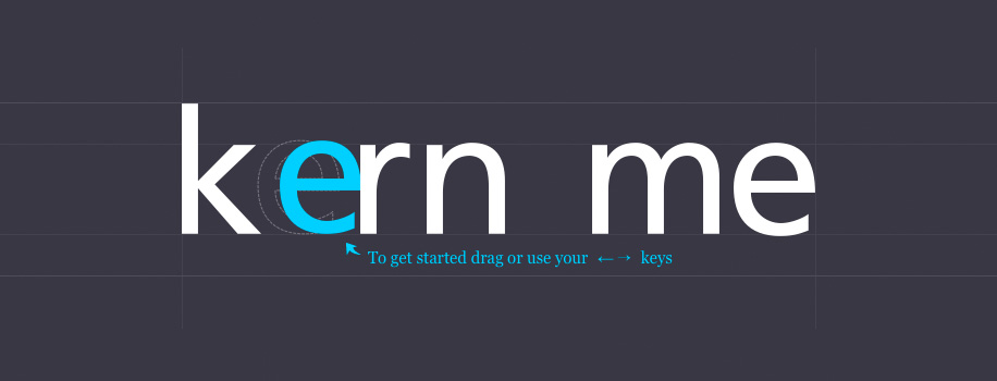
Now that we have covered the discussion of different philosophies of letterspacing, it’s time to have some fun. KernType is a game to practice your kerning that Mark MacKay, an interaction designer, has created for Method of Action, a company that says it is devoted to “peer-to-peer education for people who want to get things done”. KernType is apparently part of their online course Design for Programmers.
It took me a little time before I got the hang of KernType. It’s a cool idea for typography students and others to learn about good letterspacing, but it does need some work. While some of its solution are open for debate, there needs to be explanations for the solutions and what constitutes good type and letterspacing. KernType is still a fun an interesting idea to explore.
Try It Out Yourself